A tour of the screen editor
The screen editor is where you draw the pages, symbols and popups of a project. This page walks through its parts so that you know where to find each tool.
Before you begin
- The project is open in the screen editor. See Open a project.
Steps
1. Find your way around the menu bar and toolbars
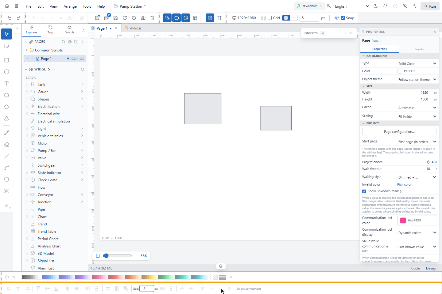
The top bar holds, from left to right, Back to Home and Configuration editor, the menu bar (File, Edit,
View, Arrange, Tools, Help) and the project name. A * after the name means that something is not
saved. At the right are the session button, which shows who is signed in to the project (Auth off when user login
is off; see Turn on authentication), the language list, the light/dark theme
switch, the alarm bell, About, then Simulate communication loss, Live preview and Run. Run starts a
test run in the editor and is not the runtime screen; Esc returns to the editor.
Below the top bar are the toolbars. Most buttons show only an icon; point at a button to see its name and shortcut. In the default profile they stand in one row:
- History: Undo (Ctrl+Z) and Redo (Ctrl+Y).
- Arrange: the four layer order buttons, Shape Operations and Format Painter. They are unavailable until you select an object.
- Project: Save (Ctrl+S) saves the open item, Save All (Ctrl+Shift+S) saves everything. Discard Changes goes back to the last saved state, Refresh loads the latest version from the server and Backups (restore) opens the saved backups.
- View and Snapping: Ruler, Center Axes, Color strip, Dim layout, Snap to Objects and Keep objects inside the page.
- Canvas: Canvas Size, then Grid, the grid spacing in px and Snap. The grid settings belong to the open page.
Every toolbar can be moved by its dotted handle, docked at another edge, floated over the canvas or hidden with a right-click. The first time you open the editor in a project, it asks for an interface profile, the overall arrangement of toolbars and panels. See Menus, toolbars and interface profiles.
2. Pick a drawing tool
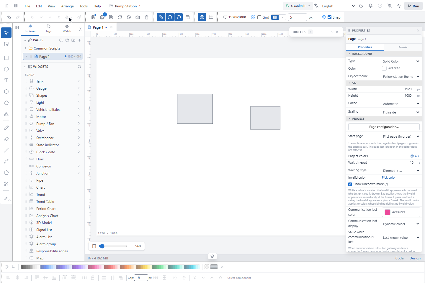
The Drawing tools toolbar, at the left edge in the default profile, holds Select, Area select (see Select and move objects), Rectangle, Circle, Text / Label, more shapes, Pen (P), Eraser (E), Line (L), Polyline, Polygon and Trim. The narrow strip next to the left panel has one button, Close Panel / Open Panel, which closes and opens the left panel.
3. Draw shapes from the shape library
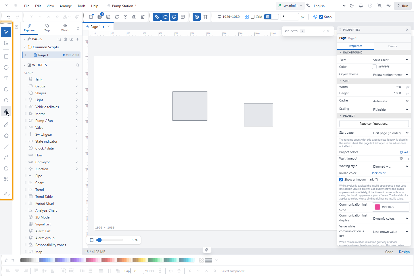
More shapes… in Drawing tools opens the shape library. Its 16 categories range from BASIC SHAPES and ARROWS to tanks and vessels, pumps, valves, piping, instrumentation (ISA-5.1), single-line power symbols, HVAC and flowcharts. Type in Search shapes… to find a shape by name. Click a shape and then draw it on the page, or drag it onto the canvas.
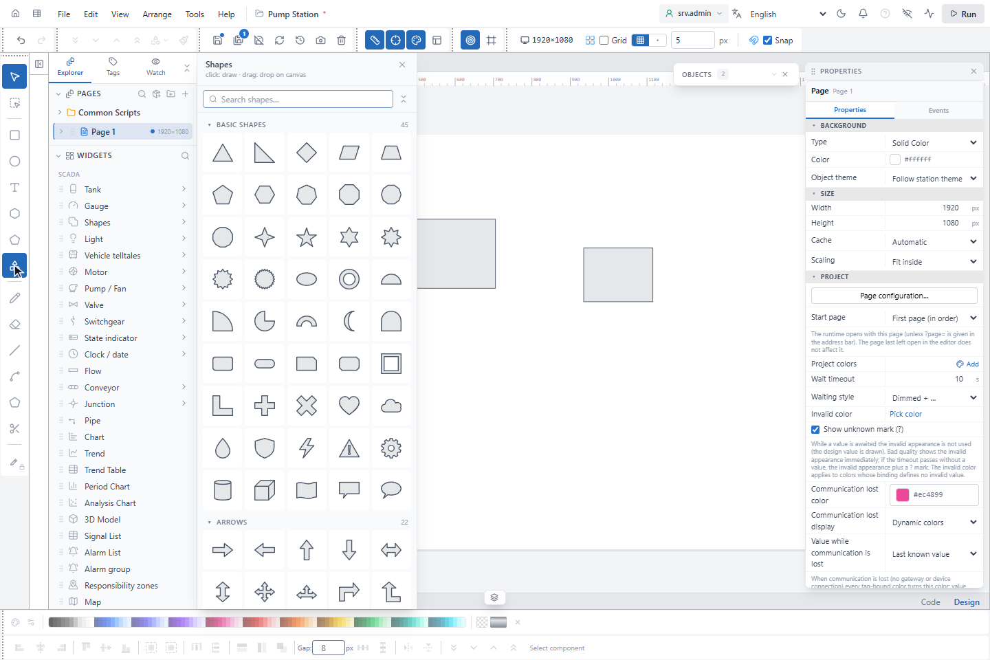
The Shapes entry in WIDGETS opens the same library. The library and the other side menus stay open while you draw, select and drop objects, so you can take several in a row. Close them with ×, by clicking the entry that opened them again, or with Esc while the menu has the focus. Opening another side menu closes the previous one.
4. Combine shapes with Shape Operations
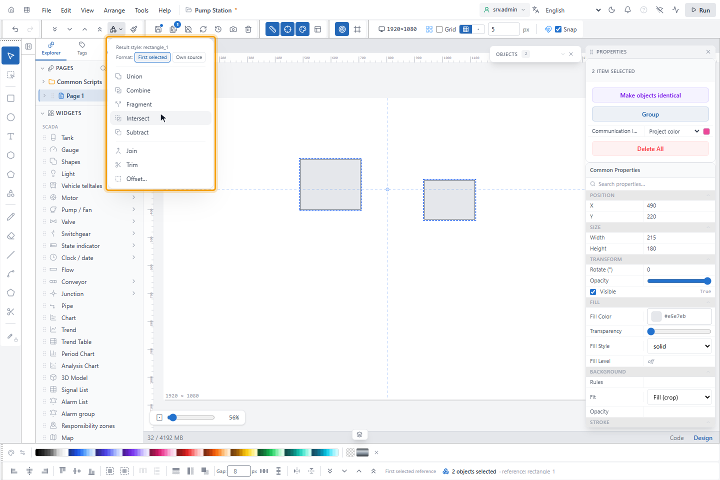
Select the shapes and open Shape Operations in the toolbar. Point at an operation to see why it is unavailable, if it is.
| Operation | What it does |
|---|---|
| Union | Merges the selected shapes into one shape along their outer outline. |
| Combine | Makes one shape; overlapping areas become holes. |
| Fragment | Breaks every region into a separate shape. |
| Intersect | Keeps only the area the shapes have in common. |
| Subtract | Subtracts the other shapes from the first selected one. |
| Join | Joins lines that touch end to end into one path. |
| Trim | Splits paths into separate pieces where they intersect. |
| Offset… | Draws outlines on both sides of the shape at an equal distance. |
At the top of the menu, Result style names the shape whose look the result takes, here rectangle_1. Under
Format, choose First selected to give every piece the look of the first selected shape, or Own source to let
each piece of Fragment and Union keep the look of the shape it came from; where shapes overlap, the topmost one
wins.
5. Use the left panel
The left panel has three tabs:
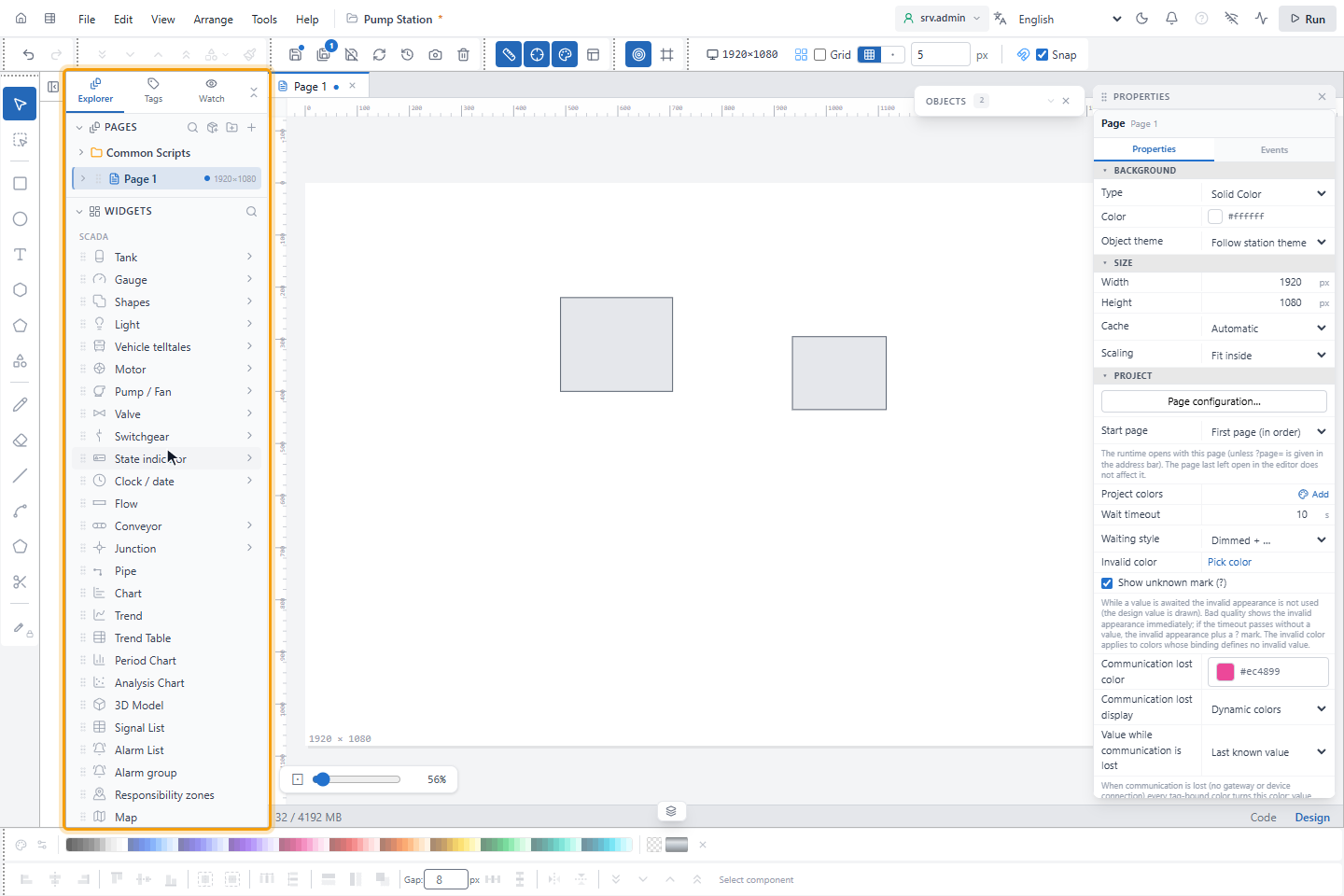
- Explorer lists the parts of the project in sections: PAGES, WIDGETS (the objects you drag onto the page), SYMBOLS, MODALS (popups) and LAYOUT.
- Tags shows the signals of the project.
- Watch shows signal values that you choose to watch.
Above PAGES, RECENTLY OPENED shows the pages you opened last, at most six, as small draft pictures with the page name. Click a picture to open the page; the open page has a blue frame. A picture is drawn from the outlines of the objects on the page (up to the first 400 objects), not from the page itself: it helps you recognise the page, it does not show it exactly. The list is kept per project in this browser and appears once at least two of its pages still exist. Click the heading to fold the section; the editor remembers the choice.
6. Add objects from WIDGETS
WIDGETS lists the ready-made SCADA objects: tanks, gauges, lights, motors, pumps and fans, valves, switchgear, state indicators, pipes, charts, signal and alarm lists, maps and more. Point at an entry to see how it works:
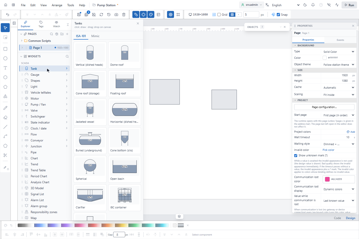
- An entry with › (for example Tank) has variants. Click it to open them and pick one: for Tank these include Vertical (dished heads), Dome roof, Horizontal (dished heads), Cone bottom (silo), Spherical, Open basin and Classic. The menus of tanks, pumps and fans, valves, motors, switchgear, conveyors and junctions have two tabs, ISA-101 and Mimic: the cards are drawn in that style, and the menu opens on the style of the project. An object taken from the other tab keeps that style. The style of the project is Equipment appearance style in the properties of the page.
- Any other entry (for example Chart) is placed directly: click it and draw on the page, or drag it onto the canvas.
7. Find the electrification tools
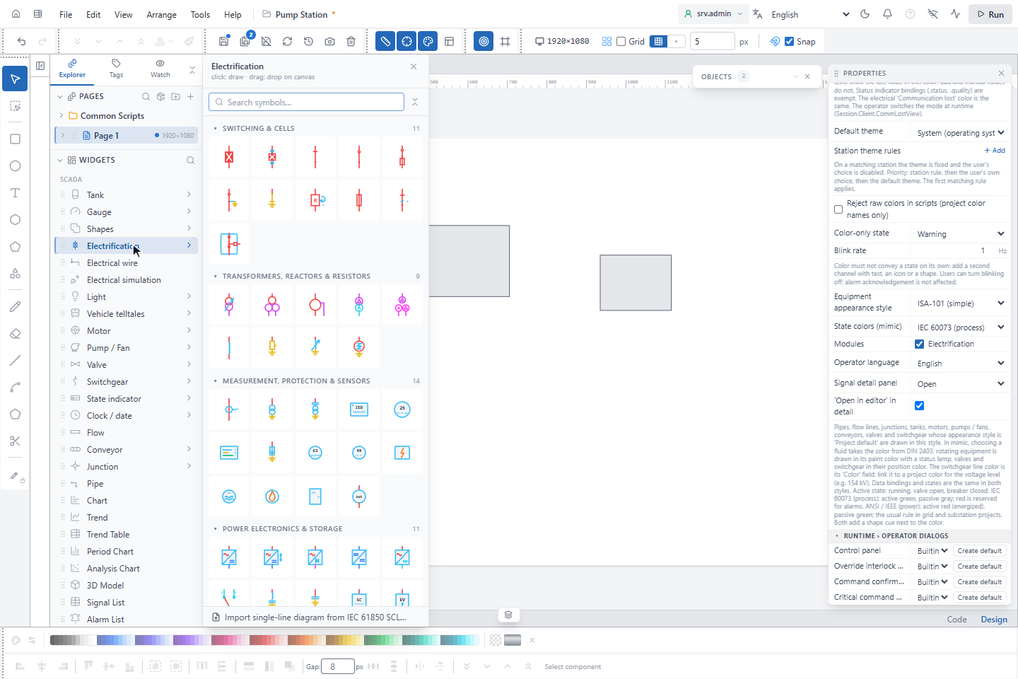
Three entries in WIDGETS are for electrical single-line diagrams:
- Electrification opens the electrical symbol library, grouped by kind, for example SWITCHING & CELLS and TRANSFORMERS, REACTORS & RESISTORS. Search symbols… finds a symbol by name. At the bottom, Import single-line diagram from IEC 61850 SCL… builds a diagram from an SCL file.
- Electrical wire draws a wire corner by corner. Clicking a symbol terminal, a busbar or another wire connects the wire there. Double-click or Enter finishes, Esc cancels and Ctrl keeps the segment horizontal or vertical.
- Electrical simulation lets you click a switch to open or close it and see the colors recalculated. The changes are not saved; Esc ends the simulation.
The three entries are shown only when Modules › Electrification is ticked under PROJECT in the page properties (click an empty place on the canvas). A new project has the module off; after changing it, save and restart the project.
8. Snap objects to the grid and to each other
Two kinds of snapping help you line objects up while you drag them:
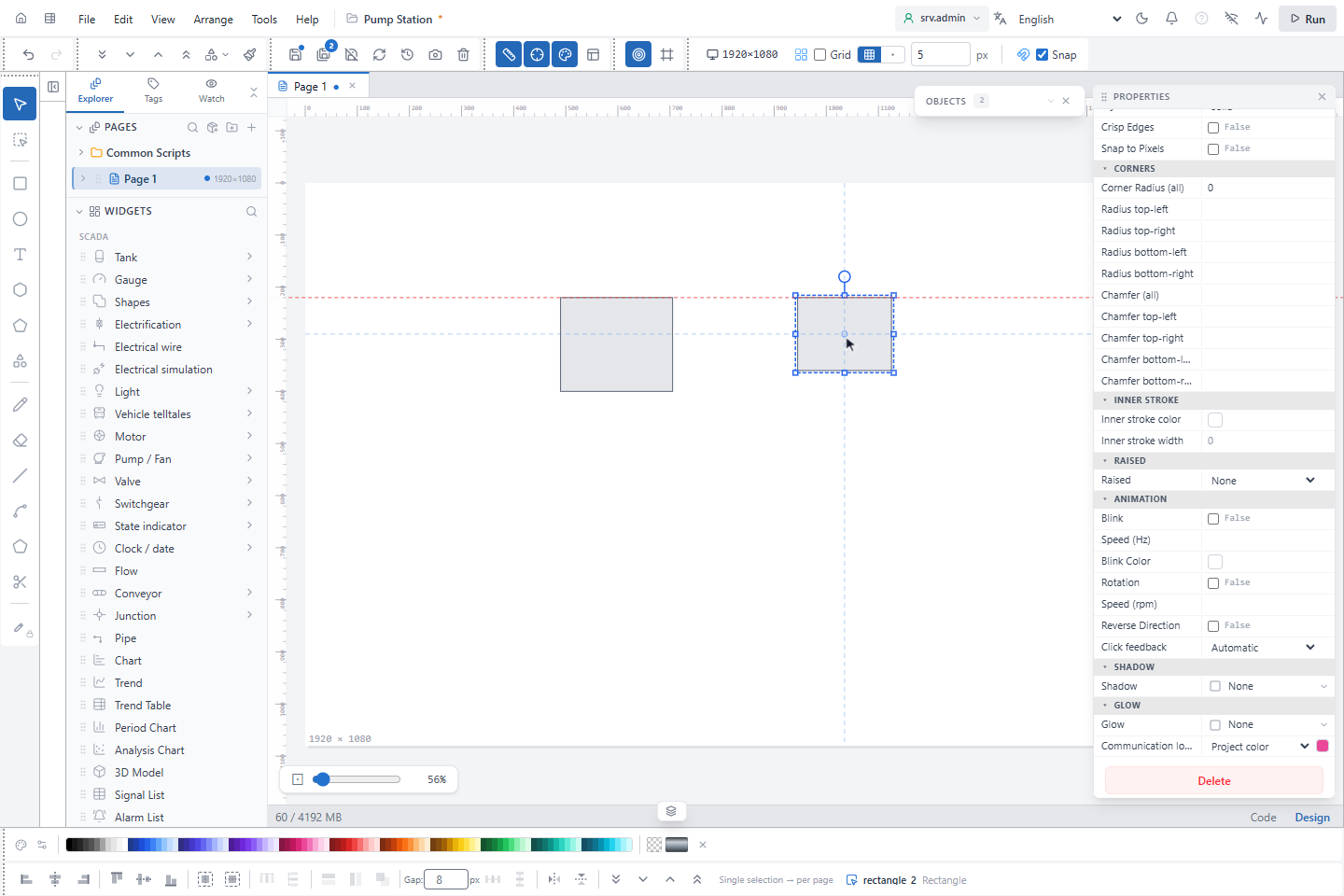
- Snap in the toolbar snaps the position to the grid. The step is the grid spacing next to Grid; it belongs to the open page. An object snaps with its top-left corner; an electrical symbol snaps with its first terminal, so that a wire drawn on the grid connects to it in a straight line.
- Snap to Objects (on by default) lines the dragged objects up with the edges and centres of the other objects. A red dashed guide line shows the edge or centre that the object snapped to. Where an object snap applies, it takes precedence over the grid.
Keep objects inside the page (off by default) stops objects from being moved outside the page. With it off, the area around the page is a free workspace; at runtime only the page is shown. This setting is remembered in the browser.
9. Read the Properties and Objects panels
The PROPERTIES panel at the right (at the left in the profile Wide — explorer on the right, which also moves the left panel to the right) has two tabs, Properties and Events. With nothing selected it shows the properties of the page: background, size and the project settings. Select an object to see its own properties, starting with Name. Press F2 to go straight to the name.
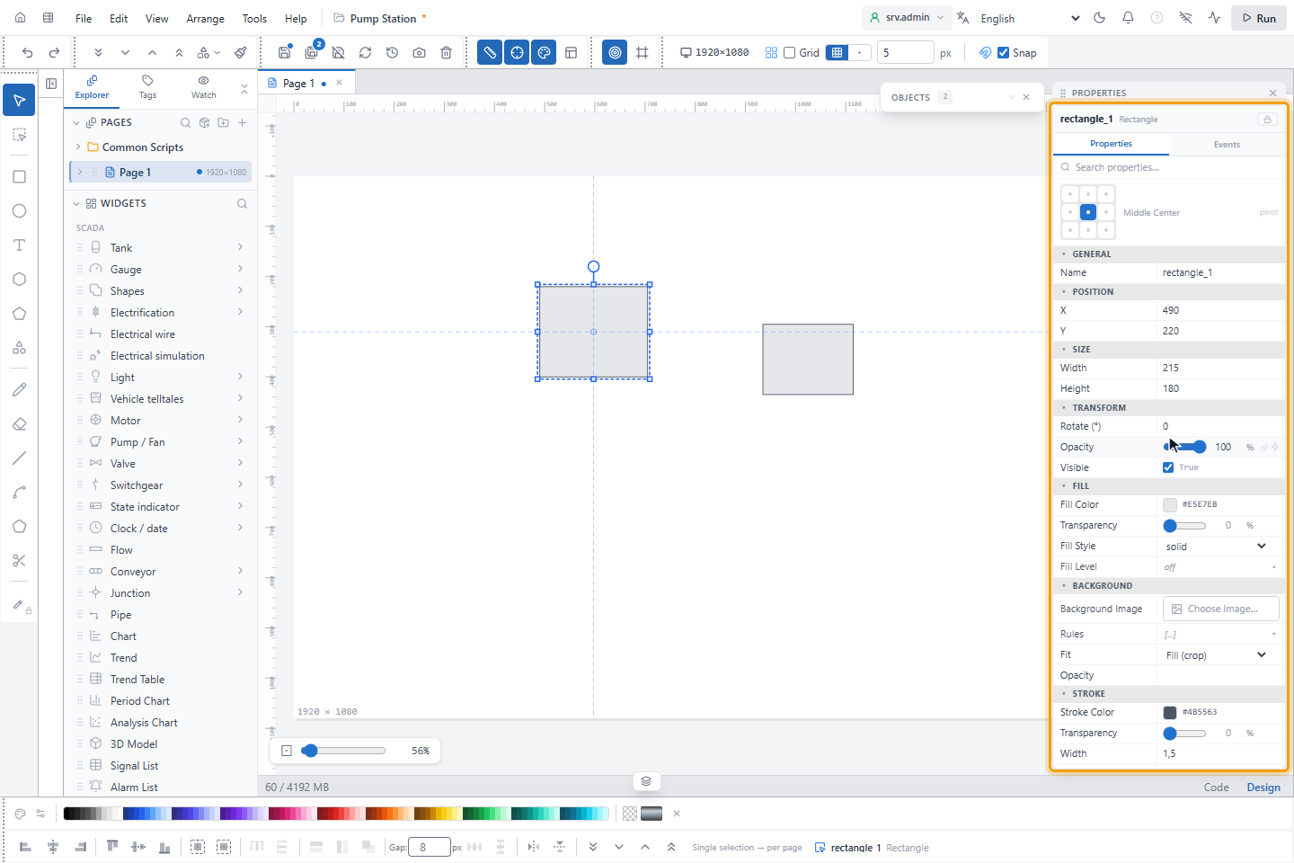
The OBJECTS panel lists the objects of the open page. Both panels can be closed with their × button and opened again from the right edge of the editor.
10. Move the Properties panel (optional)
The PROPERTIES panel can be placed anywhere over the editor:
- Drag the panel by its header to the place you want. It stays there as a floating panel.
- To put it back, drag it to the right edge of the editor (the left edge when the panels are on the left). A dashed blue area shows where it will go; release the mouse there. Double-clicking the header, or clicking Paste in the header of the floating panel, also puts it back.
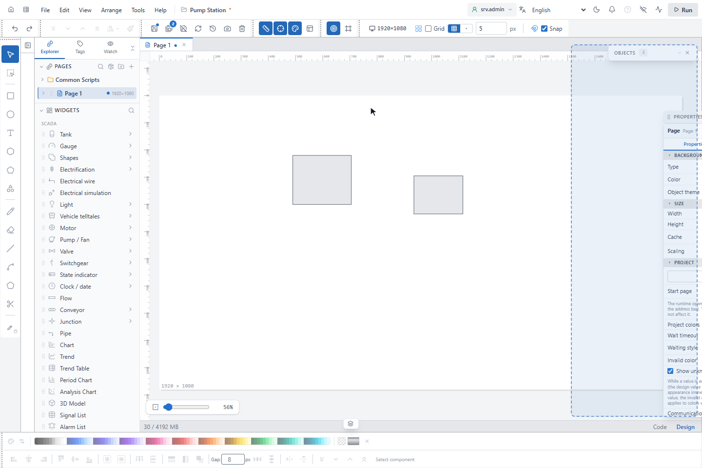
Drag the left edge of the panel to make it wider.
11. Work with tabs
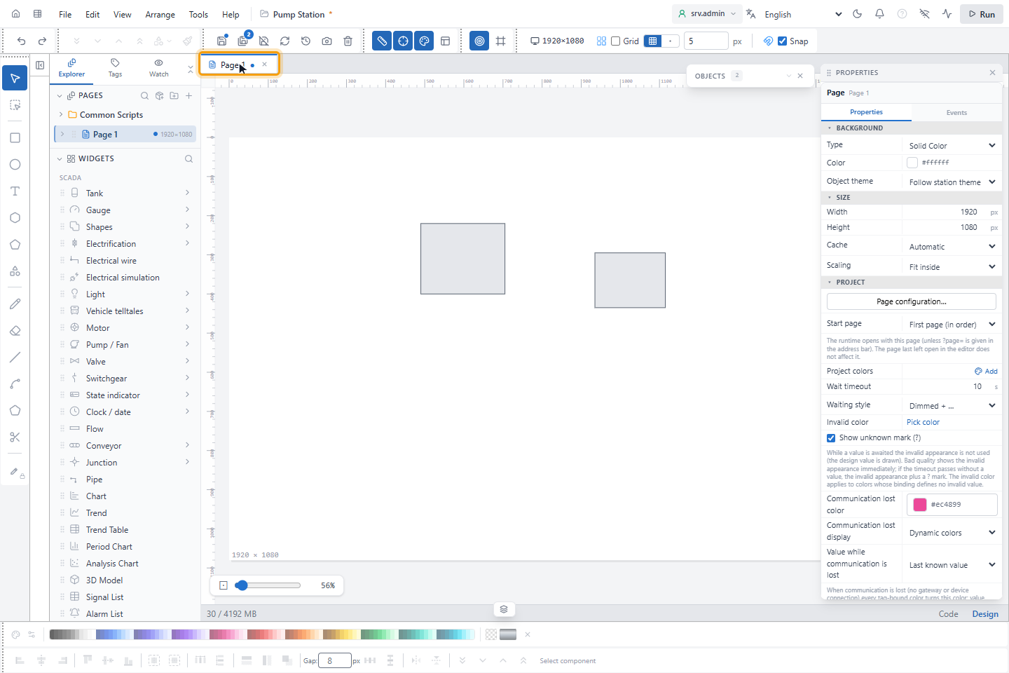
Each page, symbol, popup or script you open gets a tab above the canvas. A dot on the tab means that it has unsaved changes. Click × on the tab to close it; if it has unsaved changes, YTCC asks whether to save them.
12. Switch between Design and Code
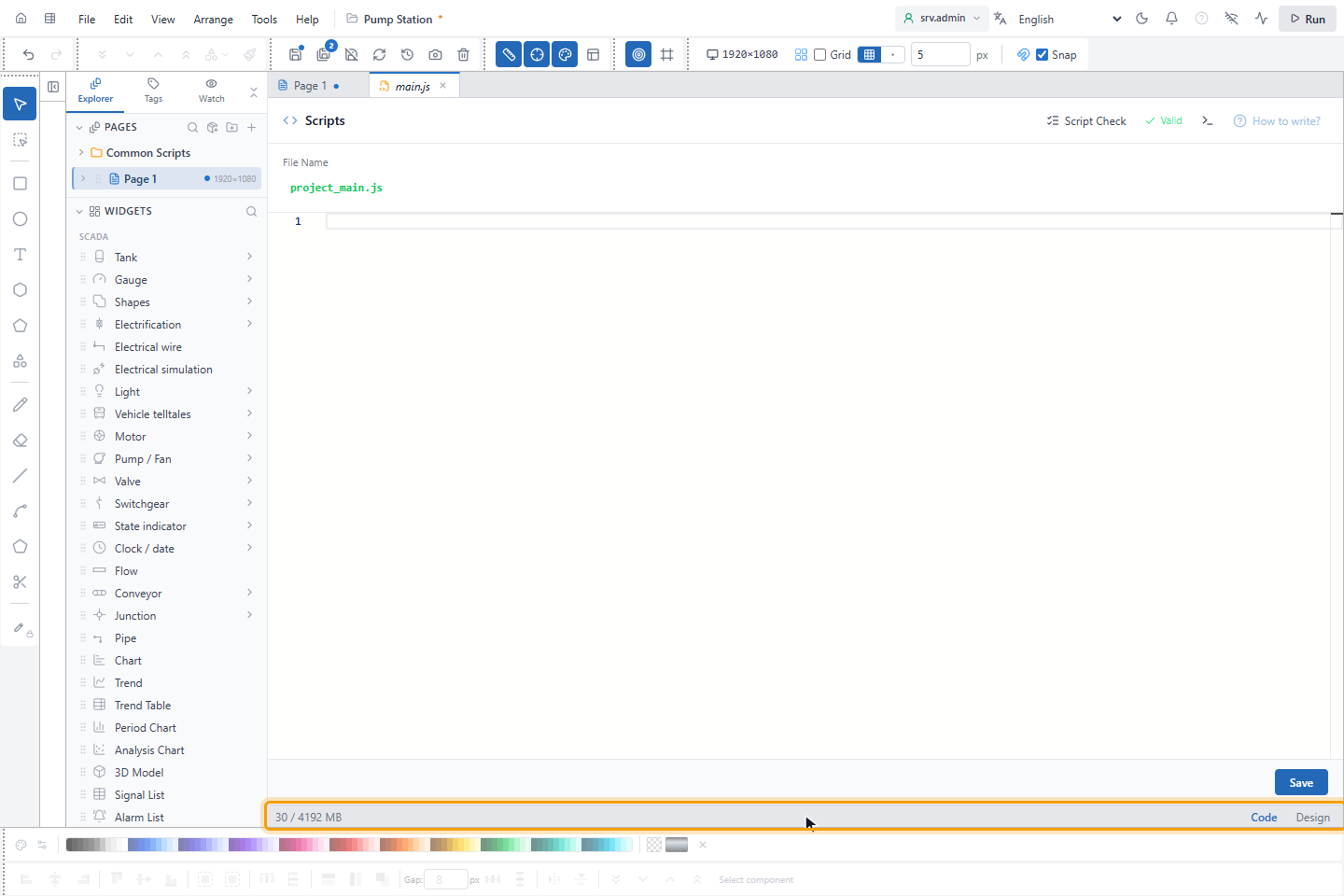
The Code and Design buttons at the bottom right switch between drawing the page and editing its scripts. Press F12 to switch. Code is not available while you edit a symbol or a popup.
At the left of the same strip, the editor shows the memory that the browser uses for it, as used / limit in MB. The value is updated every 5 seconds and turns amber above 80 % of the limit; near the limit the editor slows down. Only Chromium-based browsers, such as Chrome and Edge, report this value. Other browsers do not show it.
13. Use the bottom bars
In the default profile two toolbars stand at the bottom: the Color strip (shown when Color strip is on) and Align with the align, distribute, arrange, flip and layer order buttons. The text at the right of Align says what the buttons will use as a reference; with nothing selected it reads Select component. The zoom control with Fit to page is at the bottom left of the canvas.
Result
You know where the tools, panels and views of the screen editor are.